Notifications Center
In-App Notifications helped MX Player direct users toward shows, games, updates, and actions worth their attention. The Notification Center gave those nudges a permanent home: a tabbed hub users could open from the app bar or drawer, scan quickly, and use to jump back into relevant experiences.
Results
- Created one place for videos, games, and system messages instead of scattering nudges across the product.
- Made recommendations recoverable through All, Videos, Games, and System tabs.
- Supported re-engagement with direct actions like Watch Now and Play Now, plus clear empty and dark-theme states.
Date
Team member
Cui Shanshan
Organisation
![]()
Problem
MX Player already had useful nudges: new episodes, watch recommendations, game tournaments, rewards, app updates, withdrawals, and feedback prompts. The problem was that these messages were temporary. If a user missed or dismissed them, there was no reliable place to return to them.
The goal was simple: make notifications feel like a useful product surface, not a throwaway interruption.
Entry Points
The notification bell was added to the app bar for quick access, with unread indicators to signal fresh activity. A second entry point in the drawer made the feature discoverable from the broader account and settings area.
This kept the center close to everyday browsing while still making it available from the main navigation.
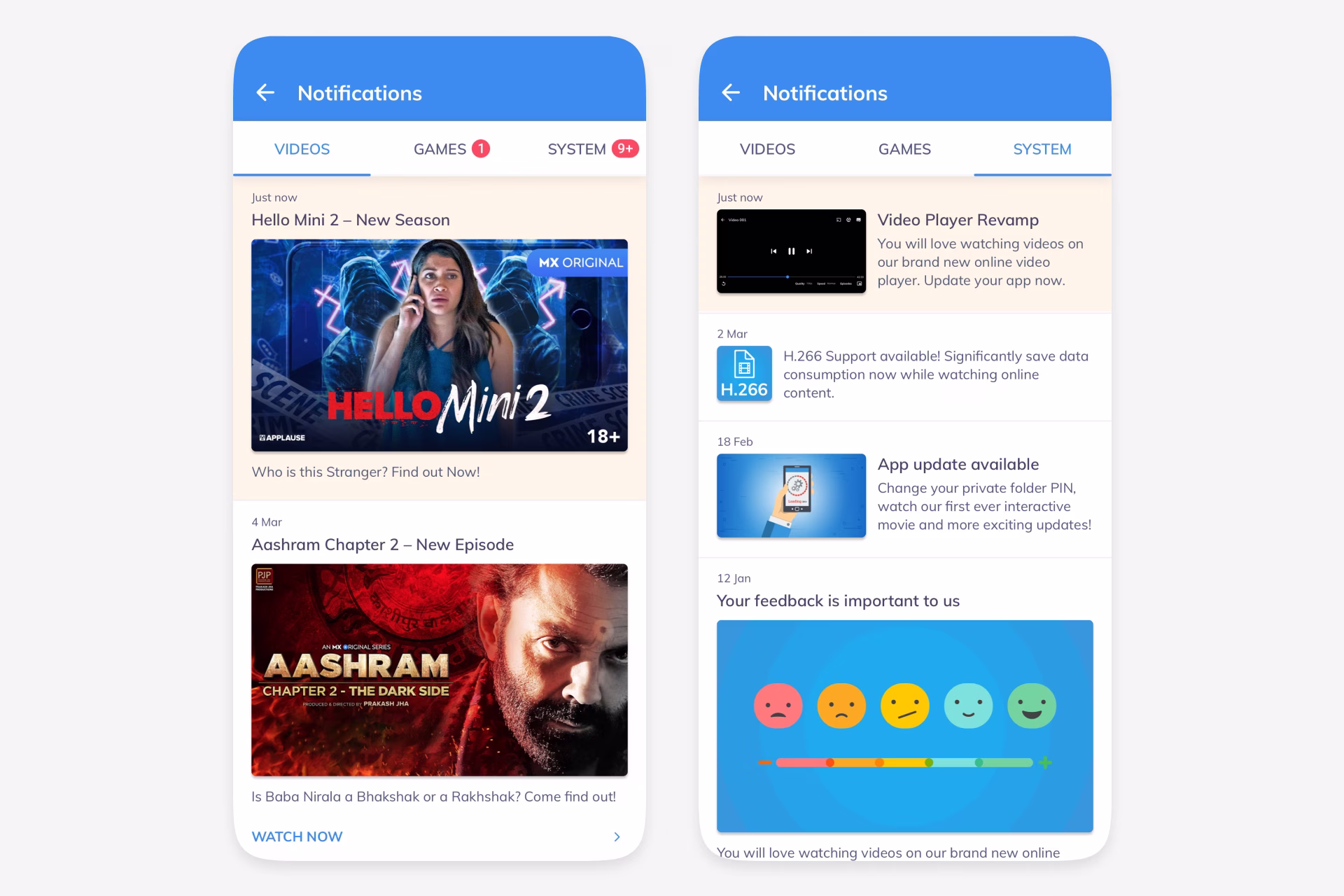
Tabbed Hub
Notifications were organised into All, Videos, Games, and System. Video cards used show artwork, episode labels, and Watch Now actions. Game cards highlighted tournaments, scratch cards, withdrawals, and Play Now paths. System messages handled app updates, storage-saving tips, and feedback prompts.
The All tab combined everything into a single timeline for users who did not want to think by category. Badges on tabs made unread counts visible without forcing users into each section.
States and Theme
The design covered the less glamorous states too: an empty screen, unread indicators, dated groups, content thumbnails, lightweight descriptions, and direct action links. The same structure also worked in dark theme, which mattered because MX Player already supported theme switching from the drawer.
The result was a concise engagement layer: not another feed, just a clear place for useful nudges to live until the user was ready to act on them.
Ideas by me. Written by AI.
I’m explicit about how I write. The ideas, point of view, and responsibility are mine. AI helps with structure, clarity, and speed.
Why I work this way →Add a comment
Your comment will be sent to me privately before being published.
Like what you see?
Let’s team up
Together, let’s redefine your business’ product experience strategy.
You can contact me at: