MX XO
MX XO recreated the popular XO game in an MX Player avatar. The goal was to keep the interaction instantly recognisable while turning it into a more competitive five-in-a-row experience, wrapped in a beautiful space-themed interface.
Results
- Turned a familiar XO mechanic into a larger, more strategic five-in-a-row game with almost no learning curve.
- Used a space-themed versus screen, neon board, player avatars, and animated round states to make each match feel energetic.
- Added lightweight social feedback through emoji reactions, clear quit confirmation, and a high-impact game-over moment.
Date
Team member
Zhang Yan
Organisation
![]()
Problem
MX Player’s games surface needed experiences that could be understood in seconds and replayed without friction. XO was a strong fit because the core interaction is already familiar, but a simple 3×3 board would have felt too small for a competitive mobile game.
The design task was to preserve the simplicity of placing Xs and Os while making the round feel bigger, more expressive, and native to MX’s entertainment ecosystem.
Familiar Core, Bigger Board
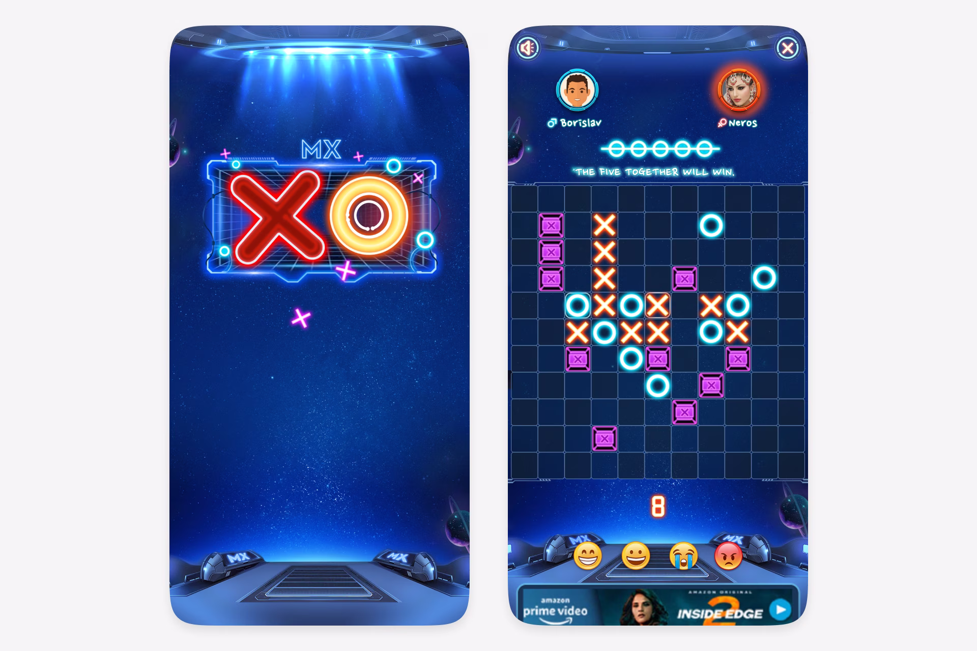
The game retained the core XO loop: quick moves, clear turns, and an obvious win condition. The larger grid changed the rhythm from a tiny puzzle into a more tactical match where the first player to place five together wins.
Because the rules were visible in the interface, the screen could stay focused on the board, current score, turn progress, and the satisfaction of building a winning line.
Spacey Match Flow
MX XO opened with a versus screen, then moved through a high-energy Ready, Steady, Go countdown before the board became active. This made even a short round feel like a match, not just a static puzzle.
The dark space backdrop, glowing board, neon X and O pieces, player avatars, and score strip gave the game an ownable MX identity while keeping the main play area readable.
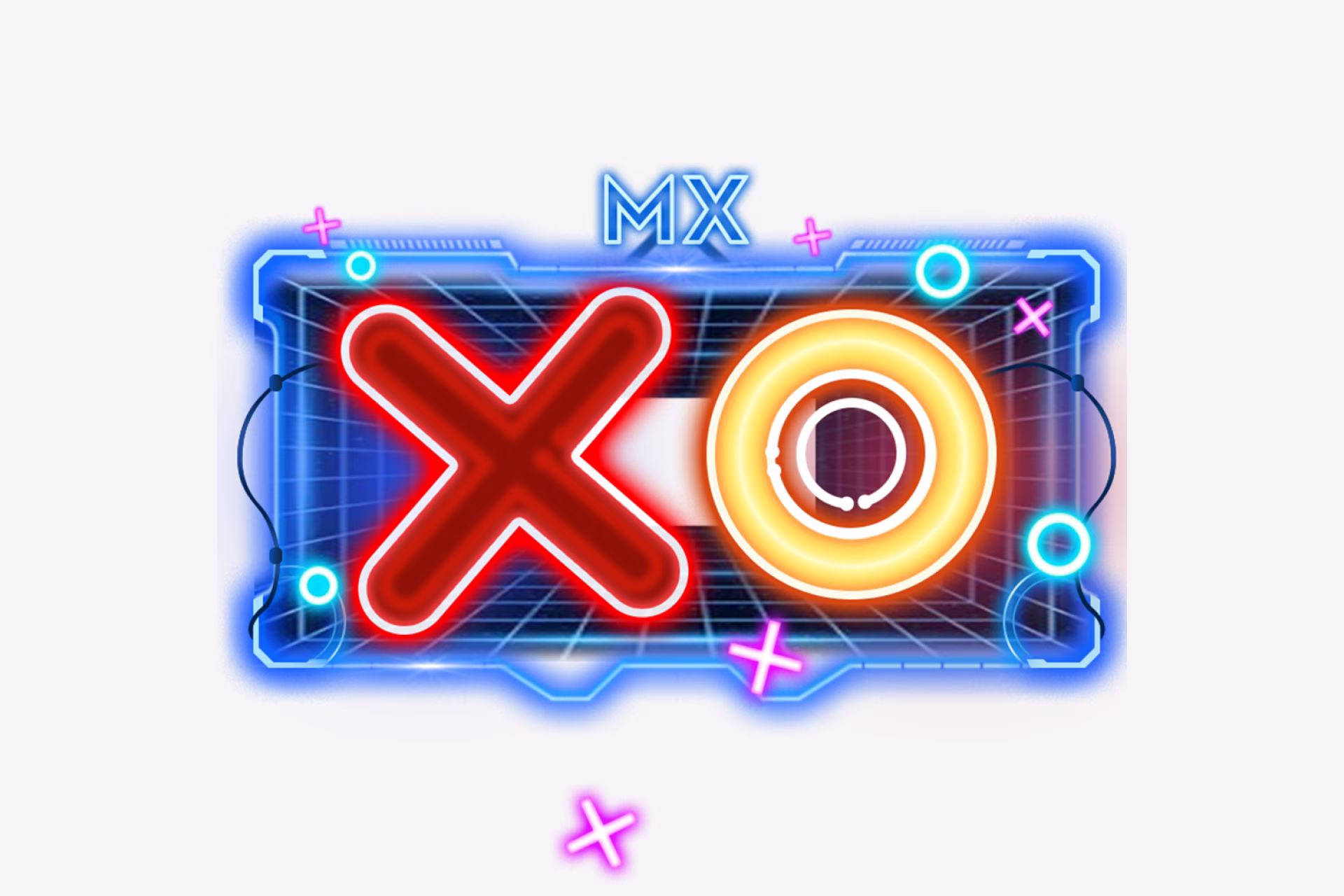
Logo Design and Branding
The logo extended the game beyond the play screen into a recognisable brand asset. A bold neon X and circular O sat inside a compact arcade-panel frame, making the mark work as a square icon while still carrying the game’s competitive, high-energy identity.
Feedback and End States
The interface covered the small moments that make a casual game feel complete: emoji reactions during play, a visible timer/score area, a confirmation dialog before quitting, and a strong Game Over state when the round ends.
That combination of familiar interaction, expanded strategy, and polished feedback helped MX XO start gaining traction as a casual, repeatable game inside the MX ecosystem.
Ideas by me. Written by AI.
I’m explicit about how I write. The ideas, point of view, and responsibility are mine. AI helps with structure, clarity, and speed.
Why I work this way →Add a comment
Your comment will be sent to me privately before being published.
Like what you see?
Let’s team up
Together, let’s redefine your business’ product experience strategy.
You can contact me at: