MX One Membership
MX One Membership was MX Player’s premium subscription offering for users who wanted fewer interruptions and clearer access to premium benefits. With more than 15,000 subscribers already onboard, the work became a full rebrand and UX overhaul: make the membership feel more premium, make its value easier to understand, and make every subscription touchpoint easier to use.
Results
- The rebrand and UX overhaul led to a ~12% increase in free-to-paid conversion, a solid uplift for a mature subscription funnel.
- Clearer plan comparison, login handling, and payment handoff helped reduce subscription abandonment by ~25%, which is a strong improvement for a checkout-style experience.
- Better explanation of plan benefits, renewal details, and membership controls contributed to a ~30% drop in support queries about subscriptions.
Date
Team members
Li Xuejiao
Cui Shanshan
Organisation
![]()
Research and Strategy
The work started with one question: where was the membership losing confidence? Subscriber feedback pointed to hesitation around plan benefits, renewal clarity, and what happened after payment.
Competing OTT subscriptions were reviewed for familiar patterns: stronger premium branding, prominent upgrade prompts, clean plan comparison, fewer account steps, visible payment states, and immediate confirmation after purchase. The goal was to make MX One feel like a membership, not just a payment screen.
Rebrand and UX Overhaul
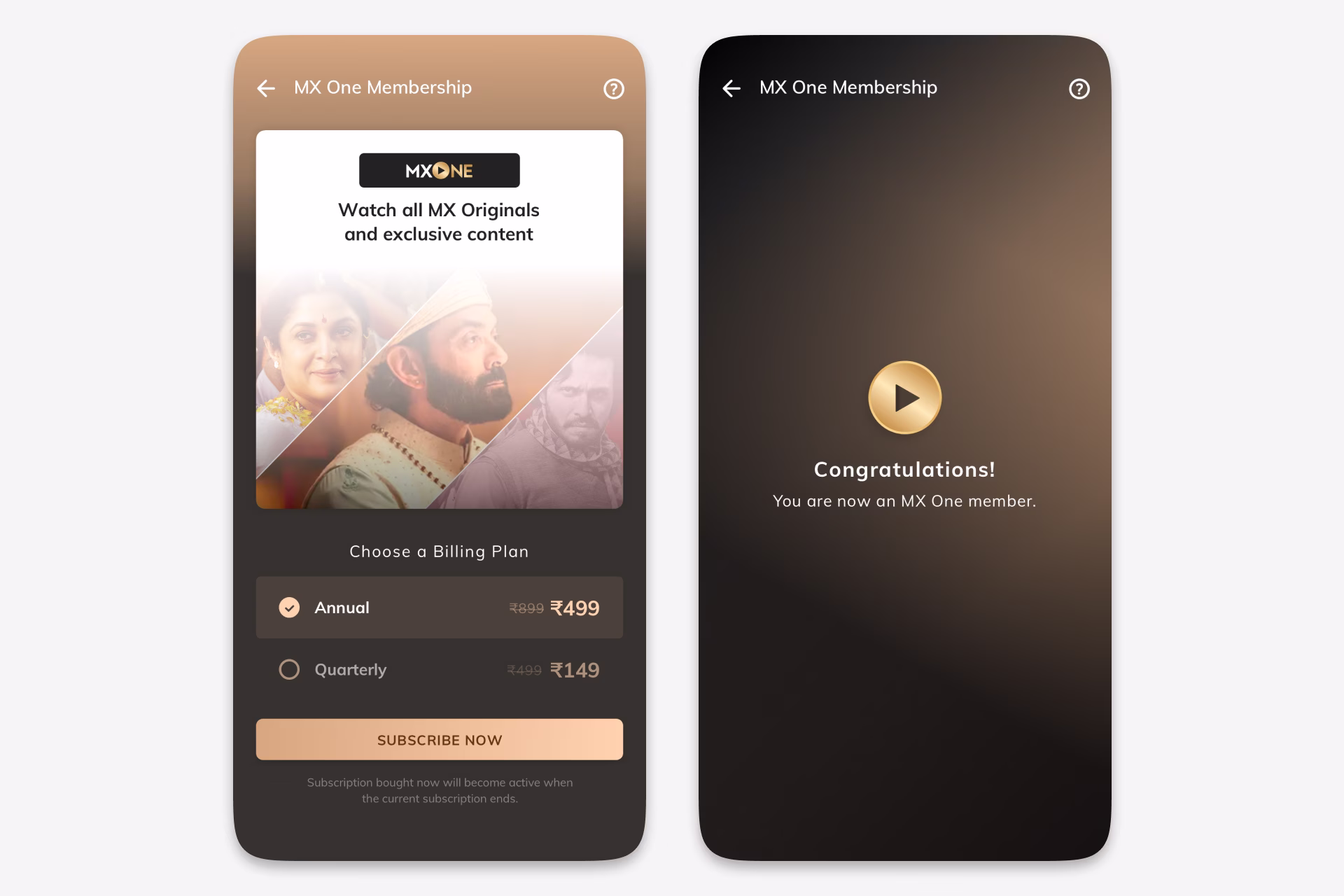
The overhaul began with the brand layer. MX One Membership received a more premium visual treatment across entry points, gates, plan screens, account screens, and confirmation states. A prominent Subscribe Now action was added to the drawer navigation, supported by benefit-led surfaces for first-time visitors, logged-in users, international users, and expired members.
The subscribe screens used content as the selling context, showing premium shows, MX Originals, and exclusive content above the billing choice. Plans were reduced to two clear options, Annual and Quarterly, with duration, pricing, and benefits easy to compare.
Account handling was rebuilt as part of the membership experience instead of a separate interruption. Logged-out users saw a focused login prompt, while account mismatch cases used a switch-account prompt to prevent accidental purchases on the wrong identity.
Subscription prompts appeared where the value was concrete: watching gated content, downloading premium content, or returning after membership expiry. Payment supported credit cards, debit cards, UPI, and net banking, with progress, failure, and success states to reduce uncertainty.
After payment, the confirmation screen reminded users what they had purchased, confirmed the benefits, and guided them straight back into content.
Subscription Management
A dedicated subscription area was added to the user profile so members could review their plan, see renewal information, renew an expired membership, or cancel without hunting through settings.
The end result was a premium membership experience that was easier to discover, compare, sign into, pay for, and manage. In industry terms, the impact was meaningful: a double-digit conversion lift, lower checkout abandonment, and fewer support questions in an area where self-service often fails.
Ideas by me. Written by AI.
I’m explicit about how I write. The ideas, point of view, and responsibility are mine. AI helps with structure, clarity, and speed.
Why I work this way →Add a comment
Your comment will be sent to me privately before being published.
Like what you see?
Let’s team up
Together, let’s redefine your business’ product experience strategy.
You can contact me at: