Medals
Medals were introduced on MX TakaTak as a reward system that used virtual achievements to motivate users to complete tasks, upload more consistently, build their follower graph, and spend more time watching videos. The work covered the full product loop: profile entry points, a dedicated My Medals vault, locked and unlocked medal states, task detail pages, sharing, and the reward moment after a medal was earned.
Results
- The reward system led to a substantial increase in user engagement, including higher time spent on the platform and increased video consumption.
- User retention improved as people returned to complete daily, upload, profile, follower, referral, and sharing tasks.
- The tiered medal system created a visible achievement layer on profiles, encouraging healthy competition and repeat participation.
Date
Team members
Wang Jin
Cui Shanshan
Organisation

Reward Strategy
MX TakaTak needed a lightweight way to make repeat engagement feel purposeful. Watching, uploading, completing profiles, inviting friends, and building mutual followers were valuable behaviours, but the interface needed a stronger feedback loop than a one-time prompt or passive counter.
Medals gave those behaviours a visible structure. Instead of treating engagement as an invisible metric, the product translated it into collectible achievements that users could understand immediately. The system tied effort to recognition: each completed task could move the user closer to a visible badge of progress.
The feature was designed as a loop, not a decorative reward shelf. Users could discover medals from their profile, inspect what had already been earned, understand what remained locked, complete the required action, unlock a medal, and then share that progress back into their social graph.
Profile Entry Points
The profile screen became the main discovery surface. Medals were placed where users already checked their identity, followers, following count, likes and uploaded videos. This made achievements feel attached to the person rather than hidden inside a separate gamification menu.
The designs explored a profile header entry, a medal strip, and a purple progress prompt that could nudge users toward the next unlock without taking over the profile. The feature needed to be noticeable enough to invite taps, but compact enough to preserve the existing profile hierarchy and video grid.
My Medals Vault
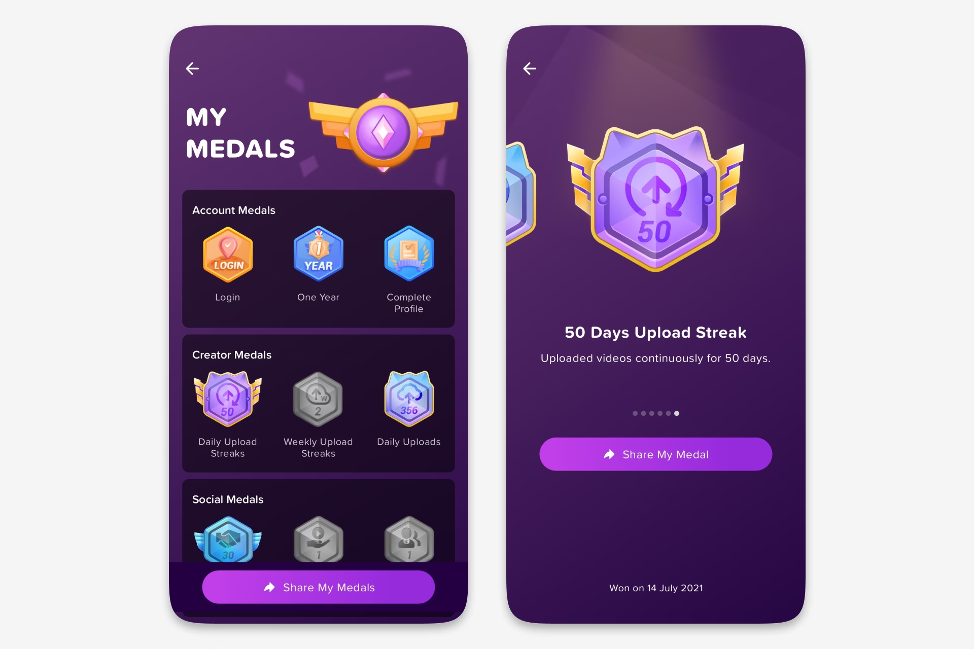
The My Medals screen organised achievements into categories such as recreation tasks, creator tasks, and social tasks. Earned medals used bright colour, dimensional highlights, and readable labels, while locked medals used muted grey variants so users could understand both their progress and the remaining opportunity.
The vault also supported a share mode. Users could select earned medals and share them through familiar channels, turning the reward system into a lightweight promotion mechanic. The interaction made a medal useful after it was earned, because recognition could travel beyond the private achievement screen.
Task Detail Screens
Each medal opened into a focused detail screen with a large medal, a short task description, supporting progress text and a single primary action. Examples included Login, One Year, Complete Profile, upload streaks, mutual follower milestones, video sharing and friend referrals.
Locked states were handled explicitly. Instead of making an unavailable medal feel broken, the grey treatment explained what the user needed to do next. This was important for milestone medals such as upload streaks and follower counts, where progress could take days or weeks and the user needed a clear reason to keep returning.
Unlocking and Sharing
The reward moment used a dedicated pop-up to make the unlock feel deliberate. The pop-up showed the earned medal, congratulated the user and gave them a direct way to share it. This was a small surface, but it completed the emotional payoff that the rest of the system was building towards.
Sharing was also considered from the medal vault. The system supported selecting achievements and pushing them outward, so medals could act as social proof and as prompts for other users to participate.
Visual System
The medal artwork was built as a scalable family. Special badges such as Login, One Year, and Complete Profile used distinct shapes and labels, while repeatable achievement tracks used tiered medal forms for counts and streaks.
Active and disabled templates were designed together. Colour, depth, glow, and label contrast made earned medals feel desirable, while disabled variants preserved the silhouette and task meaning without competing visually with unlocked achievements. This kept the grid consistent even when most medals were still unavailable.
Engagement Loop
The system connected product tasks with motivation, status, and repeat use. Users had a reason to return, a reason to complete more actions, and a visible marker of what they had achieved.
In product terms, the medal system turned engagement mechanics into a recognisable achievement layer. It encouraged task completion, increased video consumption, supported retention, and created healthy competition without requiring a heavy new social experience.
Ideas by me. Written by AI.
I’m explicit about how I write. The ideas, point of view, and responsibility are mine. AI helps with structure, clarity, and speed.
Why I work this way →Add a comment
Your comment will be sent to me privately before being published.
Like what you see?
Let’s team up
Together, let’s redefine your business’ product experience strategy.
You can contact me at: